Posts Tagged ‘color’
dPS is at it again. In two separate posts, they’ve outlined ten elements of composition in photography.
Instead of looking at composition as a set of ‘rules’ to follow – I view it as a set of ingredients that can be taken out of the pantry at any point and used to make a great ‘meal’ (photograph).
Alternatively I’ve often described it as a set of ‘tools’ that can be taken out of one’s compositional tool belt at any given time in the construction of a great image.
The key is to remember that in the same way as a chef rarely uses all the ingredients at their disposal in any dish – that a photographer rarely uses all of the ingredients of composition in the making of an image. [via dPS]
In the first post you will learn about pattern, symmetry, texture, depth of field, and lines.
In the second post you will learn about framing, perspective, space, balance, and color.
If I were you I would highlight, bookmark or favorite these posts. When you feel like your photography is getting a little “boring” take a look and refresh your memory on some good ideas for changing up your photos.
So What’s The Best Color to Use?
Posted on: 17 April 2008
- In: color
- Leave a Comment
Ever have trouble working out color schemes for your web site, design pieces, or maybe even your living room decorating project? Check out this nifty little site right here. It’s called ColorSchemer and with a click of a mouse, it will show you all the related colors to work with the main color of your choice – kind of a cool little color resource. Here is the link to their blog. [via Digital Protalk]
This is a great link and you can download it to either Mac or Windows. I’ve downloaded it and tried it. A must have. Thank you David for the link.
Color Management Part II
Posted on: 8 May 2007
- In: color
- Leave a Comment
Ok. So we know what CMS is and why it’s important. Right?
Just to refresh everyone–The goal of a Color Management System (CMS) is to provide color consistency and predictability between devices. The characterization of a device is also called its profile. Color profiles are custom-created for the device at hand to tell applications how to compensate for the specific interpretation of each color by the device. Now let’s try to get a better handle on Color Profiles. The simplest explanation I think, comes from DryCreek Photo:
Profiles are simply look-up tables that describe the properties of a color space. They define the most saturated colors available in a color space; i.e. the bluest blue or deepest black your printer can produce. If you don’t have a profile, the trio of Red, Green, and Blue values (or CMYK) that make up a color have no particular meaning — you can say something is blue, but not exactly which shade of blue. Accurate profiles are the key to a color managed workflow. With accurate monitor and printer profiles, your prints will closely match what you see on your monitor. Without profiles, you need to rely on trial and error combined with good old-fashioned guessing [via DryCreek Photo].
So in order to actually see the colors as they truly should be and not simply guess what they should be we start by profiling the monitor. Only then can we be sure that what we see really looks the way we think it does.
Calibrating and profiling involves adjusting luminance (brightness and contrast) of monitor white and black (the white point and black point), the color temperature of monitor white and the color response characteristics including the gamma curve for each color channel (red, green, and blue). All this information then goes into the resulting display profile to enable the Color Management System on your computer to properly compensate for the peculiarities of how your monitor responds to color. You may be familiar with Adobe Gamma that comes with Photoshop. While this is certainly better than nothing, it is not really an adequate monitor profiling solution. It only deals with gamma and not luminance or color temperature and also relies on you to visually determine what is right. A true profiling solution such as Monaco [Color Vision or Gretag Macbeth] comes with a small device called a colorimeter that sticks to your monitor to tell the accompanying software what color your monitor is really producing so you get a much higher degree of accuracy. The human eye adapts far too easily to color temperature in particular to be able to do this reliably on its own. [For more see Earthbound Light]
Outback Digital Photo has more to say on the subject of Hardware Monitor Calibration Systems. Their site is definitely work checking out if you are in the market for a new calibration system. One thing I do want to note however is that I have heard that suction cups can be damaging on LCD monitors when they are removed. I have noticed that the new Pantone Huey is receiving wide popularity. I purchased one some time back when they first came out and was disappointed because of the suction cups. I merely took a razor blade and cut the cups off and now I have to hold the sensor to the screen when it is time for calibration. I notice no difference in the system with this little change. I simply make this note to readers to beware when purchasing for CRT screens as opposed to LCD screens.
Now that the monitor is calibrated and profiled you send something to print and…does the printer output match the monitor output? If not, we’ll try and tackle printer profiles in Part III.
Color Management Part I
Posted on: 4 May 2007
- In: color
- Leave a Comment
Do these words bother anyone other than me? Color Management. This term can be so nebulous as to be confused with color calibration, color profiling or perhaps include both and all of the above. So for the next couple of days I’d like to devote some time to a discussion of color management. My first visit is to wikipedia–the www encyclopedia of the world. I went to first find out what a working definition of color management is.
In digital imaging systems, color management is the controlled conversion between the colors of various color devices, such as scanners, digital cameras, monitors, TV screens, film printers, printers, offset presses, and corresponding media. The primary goal of color management is to obtain a good match across color devices; for example, a video which should appear the same color on a computer LCD monitor, a plasma TV screen, and on a printed frame of video. Color management helps to achieve the same appearance on all of these devices, provided the devices are capable of delivering the needed color intensities (via wikipedia).
What is a Color Management System (CMS)? and
Why Do We Need a CMS?
I think it is fair to say that as photographers we can all agree with the goal of a Color Management System (CMS) is to provide color consistency and predictability between devices. According to Digital Outback Photo, color management systems take various forms, but at their most basic,
…they consist of three core elements: an engine that transforms color contained in images and documents, device profiles that represent the color capabilities of a printer, monitor, scanner, or camera, and an interface that allows users or applications to utilize and manage the capabilities of the system (via Digital Outback Photo).
Consider the following analogy:
In many ways, communication in color has problems similar to those with communication in languages. Each device is like a person, speaking his or her own language. When one person that speaks French attempts to communicate with another person that speaks Japanese, there is a breakdown, and the message is not communicated accurately, if at all. What’s needed is an interpreter that is capable of interpreting the language as well as the dialect, to ensure that the message is properly communicated. The same holds true for color reproduction (via Digital Outback Photo).
Now as far as “languages” go, most monitors and cameras “speak” in red, green, and blue (RGB), while printers and scanners are bilingual and can “speak” RGB and cyan, magenta, yellow, and black (CMYK). Add to this the human eye which can see (“speak”) far more colors (millions) than any device on today’s market.
So we begin to notice problems when the colors seen on our display are much brighter and more saturated than the color that comes out on the printer. The reason for this is likely that the the color on the display is in gamut for the display, but is not in gamut for the printer. Let’s say for instance you want to represent the purest red you can possibly get. In that case you’re probably thinking about red that in Photoshop RGB is notated as R-255, G=0, B=0. This purest red will visually look different depending on whether you are viewing it via a scanner, a CRT-monitor, a LCD-monitor, a digital camera, or a printer. In this case, the color is said to be device dependent–the desired appearance of color depends on its being reproduced on a particular device. Several different factors determine which color is substituted for the original color, better known as gamut mapping.
Another challenge exists in the method that desktop devices communicate with each other. It’s typical to have a camera, display and printer from three different manufacturers, as well as image manipulation and page layout software from different software vendors. But none of these devices communicate in the same language of color, and many handle color differently–much like the example of human speech.
Color management systems link these disparate pieces together, and attempt to provide a consistent way for devices and applications to interpret color data. The characterization of a device is also called ‘profiling.’ Modern operating systems and imaging editing applications use the International Color Consortium’s (ICC) color management model that has ICC colour profiles at its core. Profiles that are custom-created for the device at hand tell applications how to compensate for the specific interpretation of each color by the device. Most manufacturers of monitors, scanners and printers deliver standard profiles with their devices. We’ll discuss color profiles in Part II.
Layers offers Four Methods to Remove Colorcast. You may recall an earlier post on Color Correction. In that post, it appears I have essentially combined methods two and three. This brings up the question, and now I’ll have to give it a try…Can the same (or similar) results be obtained by doing just step 2, just step 3 or steps 2 and 3 combined.
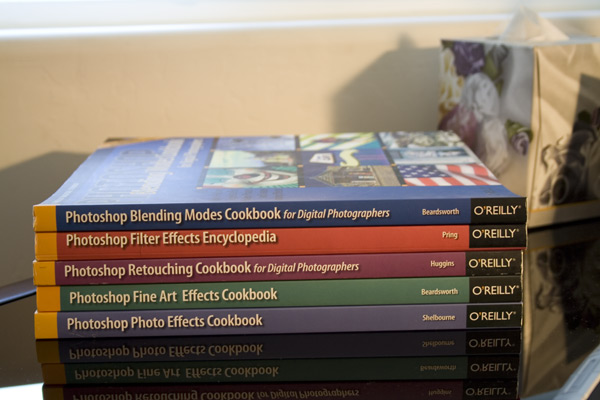
Let’s see? I’m going to give it a try on a photo of my new books I received in the mail last night. Yep, these are the ones I WON for free ($150 value not including shipping and handling)!!! They are fantastic.
Without color correction:
Just Highlights and Shadows:

Just 50% Gray Level:

All Three (Highlights, Shadows, and Gray):

It looks to me like the original was too warm. Correcting just the shadows and highlights left the photo warm and washed out the colors a little. Correcting with the 50% gray finally made the photo cooler. When correcting all three, there appears to be that color fading again. It’s a matter of preference, but for me, I see no reason to correct anything but the gray. I prefer the third image and would just do a little tweeking on the curves to bring back some of the color saturation. You be the judge.
For those of you who want to go out and spend $60 or more on a Color Card as suggested in Method #4, Gretag Macbeth will be happy to take your money. Or you could go with just a 50% gray card for a fraction of that cost.
